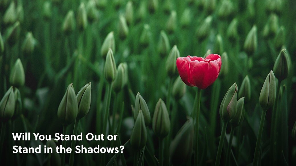
Will You Stand Out or Stand in the Shadows?
As retailers, designers, and manufacturers in the home furnishings industry, you know that standing out is not an option. You must grab attention, be bold, decisive, and different to move the needle.
Standing out is mandatory.
So, why then, is your website a one-size-fits-all knock-off of Apple aesthetics?
Does that question make you a little angry? Did you curse us in your head? Good. Because that is the beginning of a conversation about creating a more compelling visual identity and releasing the “safe” or “prescribed” formula handed to you by your site designer.
Of course, that’s not to say that your designer’s formula is bad. He or she will likely say that they’re following a set of rules for user experience. Although, as the decision-maker, you need to know that user experience has precious little to do with the fonts, colors, and shadows used on your site.
User experience is a way of assembling your site’s elements in a way that is easy-to-use and navigate. It’s about putting things where people expect them to be to improve movements between Points A and B.
User Experience DOES NOT dictate identity-creating markers for your brand.
Web brutalism emerged in response to the complacent, homogenized design trend most of us see today. With a wink to 50’s architecture, it’s heavy, function-oriented and carries bare bones. Think Craigslist. It’s definitely not stylized, but it works. And, like all things, what once was punk is now becoming mainstream. But, that doesn’t mean that brutalism is the answer for you, either.
So, what is the answer?
Just like in home décor, all trends meld and merge, becoming predictable and cookie-cutter . . . UNTIL people are bold enough to step out and reclaim the space.
That’s your cue.
Why not push your site designer a little bit? Encourage them to leave the safety zone and play with unusual elements that are still on-brand for your business? As long as you know your audience and what they will and will not tolerate, it creates a breath of fresh air for a claustrophobic online landscape.
Want to start small?
Begin with small elements, like font and color - not every website has to have a plain white background.
Figure out what makes your brand unique and showcase that through smarter website design.
At the end of the day, designs change; aesthetics need updating; and all styles need a refresh. Those in the home furnishings industry know that best. Case in point? Country blue and mauve.
Whether brutalist or minimalist, website design trends will change again and again. But, the best takeaway from brutalism is this: push yourself to create a visual identity that helps you stand out in your space. Step out of the shadows and shine with a website that truly reflects you and/or your business.
Yes, it’s scary. Being yourself takes crazy amounts of courage. Although, when you find the balance between being true to your brand and what’s aesthetically appealing to your target audience, you won’t be able to stop yourself from telling everyone to go visit your website. When your visual identity is true to you, you’ll become your own best salesperson because you’ll be so excited about what you created.
How will you make a small change to stand out more? What prescription are you willing to drop to shine your brand light? When will you implement a plan to create a stronger visual identity? Leave a comment in the section below. We want to hear from you and learn more about all the ways you want to grow.